Black Sheep Distillery
Logo Design
visual Identity
BRand voice
Packaging
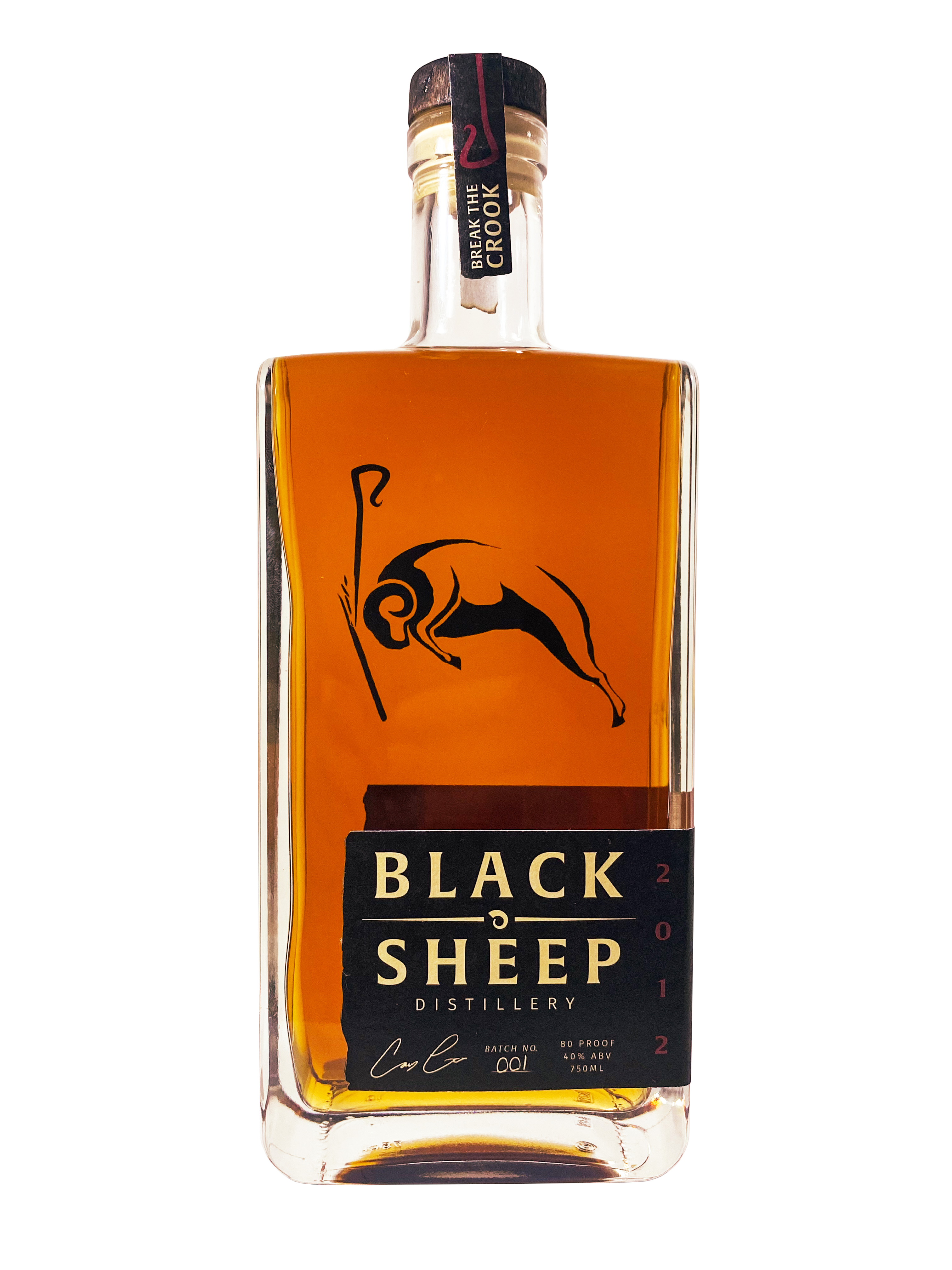
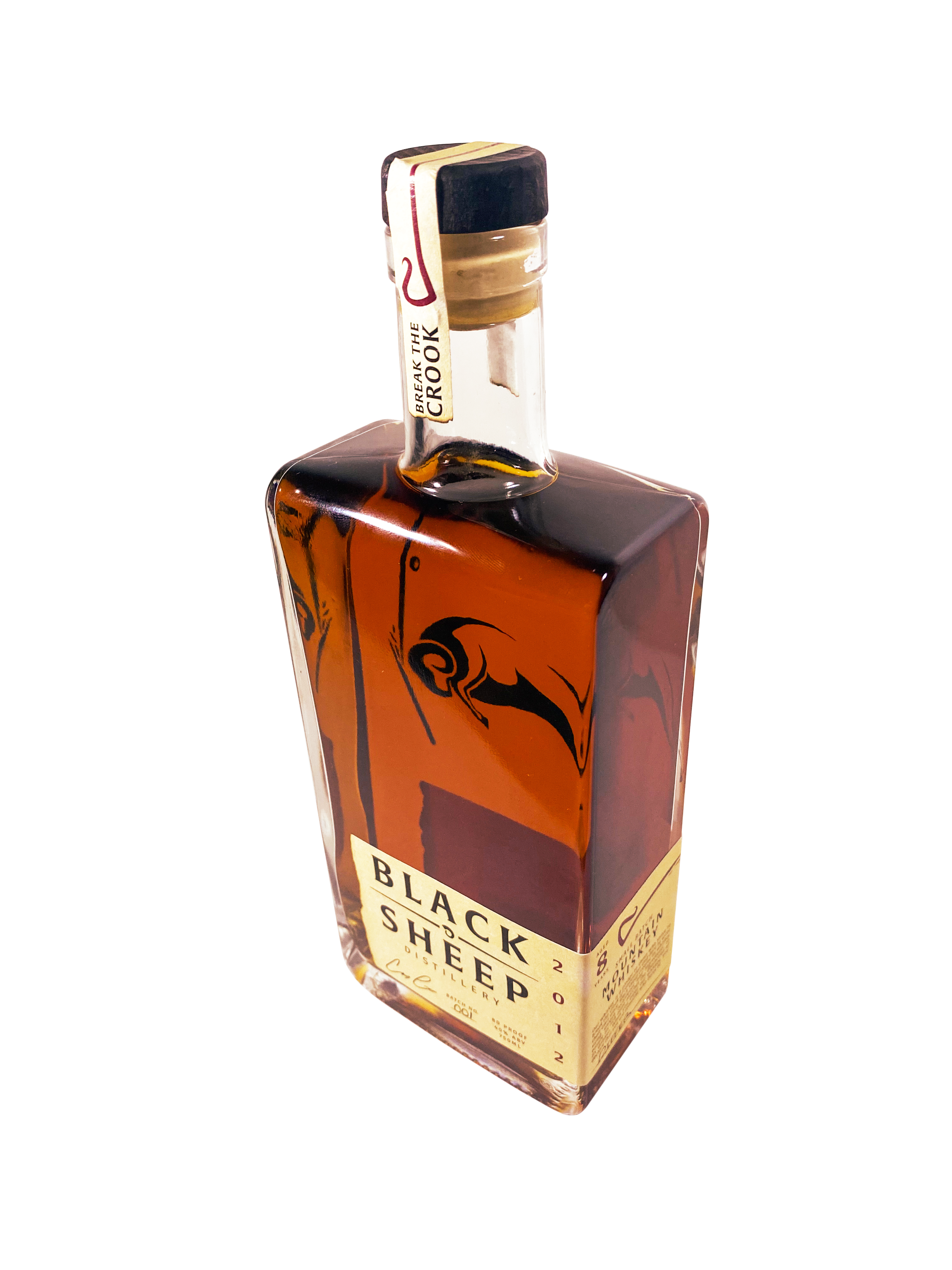
A unique whiskey made for those who defy convention and create their own path. This distillery dared to make a whiskey different than the rest and we created a brand to reflect just that.
Product Concept

Approach
connect with the new era of whiskey drinkers
Deliverables
breaking the crook
of convention
We built a brand that matched the tone of Black Sheep whiskey, daring it’s drinkers to be bold, individual, and celebrate being distinct. The branding process included bringing an underlying principle to every design, that this is not a conventional whiskey. This unique brand demands a distinct font and color palette that blends smooth and rugged, balance, yet distinct, and unique with austere, to create a logo of warmth and smoothness that takes into account the raw origins of Black Sheep Distillery and the spirit of its drinkers.

01 logo design
created a word logo and active icon that brought out the rugged vibe and messaging of this brand.
02 Visual identity
devised an identity that showcases the uniqueness of the whiskey and its drinker while generating a sense of rugged individualism.
03 brand voice
crafting a message that speaks to those who connect with being their own person and focuses on what makes them unique
04 packaging
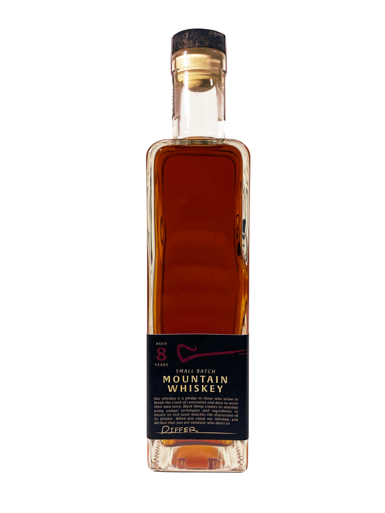
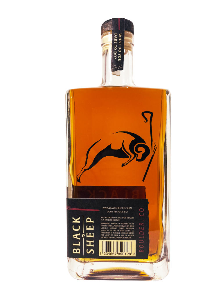
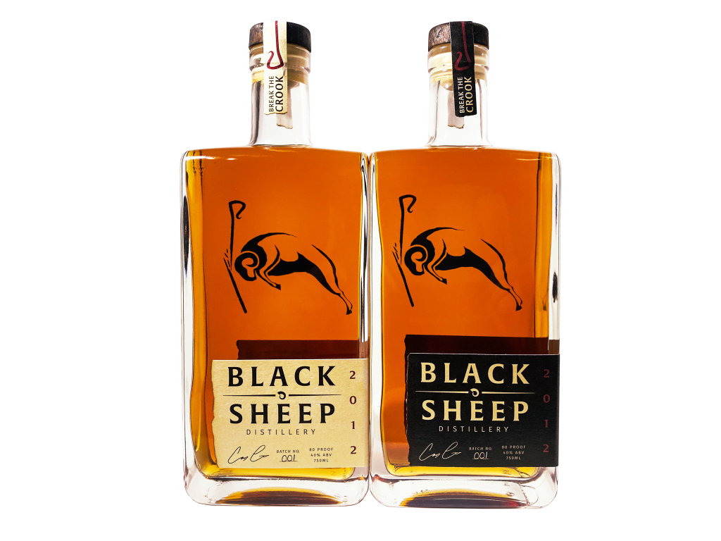
from burning the bottle cap and label edges, to a cap label that requires the drinker to break the crook of convention when opening, we created a packaging design that actively commits drinker to product.
Logo Design
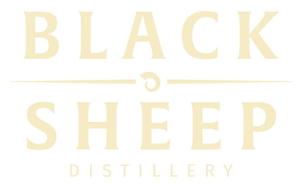
Primary Logo

Primary Icon

Secondary Icon
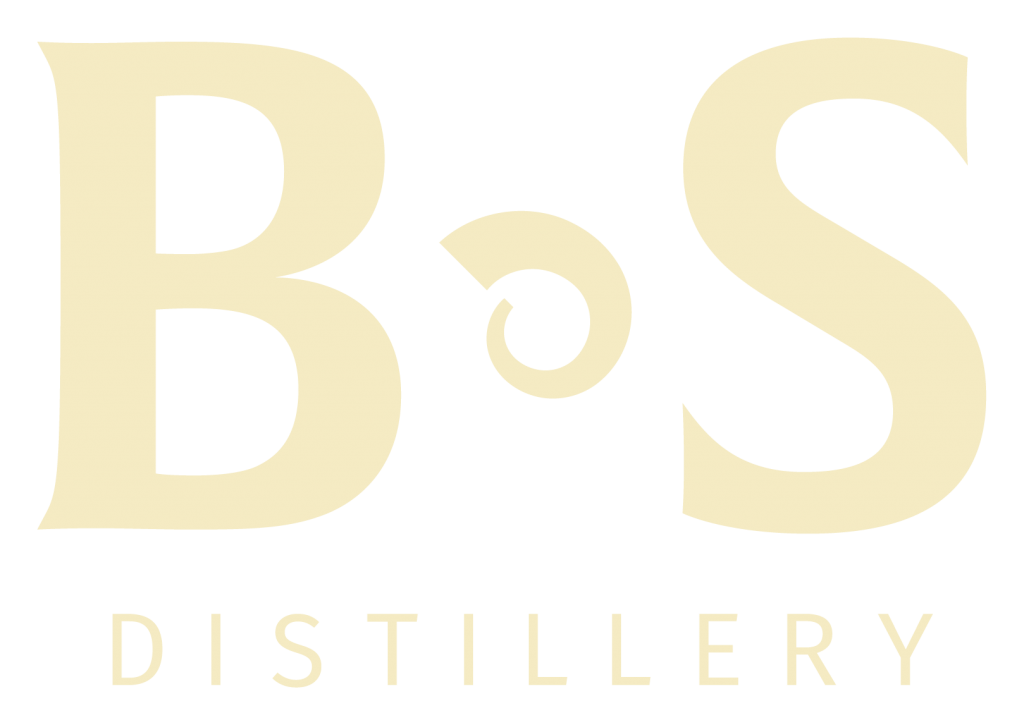
Reduced Logo
Visual Identity
adding character with distinctive details
Alverata
A font to represent the austerity of the black sheep motive by using a text with rigid lines and raw feel.
Fira Sans
A secondary font to bring to life the viscosity of the whiskey itself, with smooth lines and a stout stature.
Raw Hide
Hex | #F5EBC3
CMYK | 4%, 5%, 27%, 0%
RGB | R245, G235, B195
A raw but subtle cream color bringing to life the uneven and rocky tone of this mountain whiskey.
Burnt
Hex | #000000
CMYK | 0%, 0%, 0%, 0%
RGB | R000, G000, B000
A straight black to match the untraditional method of burning the whiskey bottle cap and side edging of the label.
Smooth
Hex | #861D1A
CMYK | 29%, 98%, 100%, 3%
RGB | R134, G029, B036
A deep, rich red that illustrates the color of this whiskey and accents burnt and raw hide.
Brand Voice
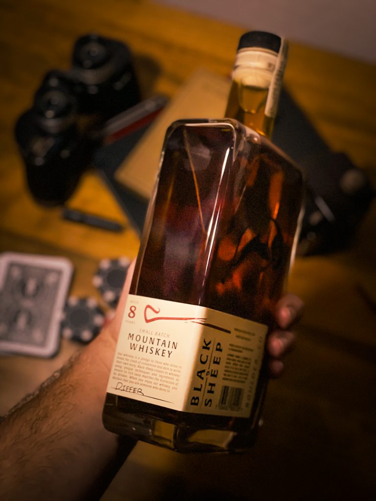
mountain whiskey
for those who dare to

Our whiskey is a pledge to strive to break the crook of convention and dare to write their own story. Black Sheep creates its whiskey using unique techniques and ingredients to ensure its rich taste matches the distinction of its drinker. When you drink our whiskey, you declare that you are someone who dares to differ.
Packaging
no detail is too small
