Elizabeth Beil Nutrition
Logo Design
Marketing
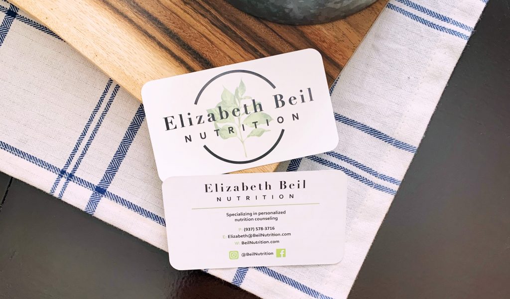
Business Card
A dietitian who provides services both online and in person, with a realistic approach to food and dietary needs.

Approach
stand apart from other dietary messaging
Deliverables
a wholistic nutritional approach
This project required building a logo design that reflected not only the type of business Elizabeth Beil Nutrition is, but her nutritional philosophy of simple and realistic.
Elizabeth’s focus is to meet clients where they are in their nutritional needs and working together to make simple, realistic nutritional changes to produce a happier and healthier person. We used her approach to nutrition to create a logo built to have a sense of freshness, be simple but wholistic, and be welcoming to potential customers seeking assistance with their individual nutrition needs.
01 logo design
A natural icon intertwined with a word logo focused on giving a fresh and informative look
02 marketing
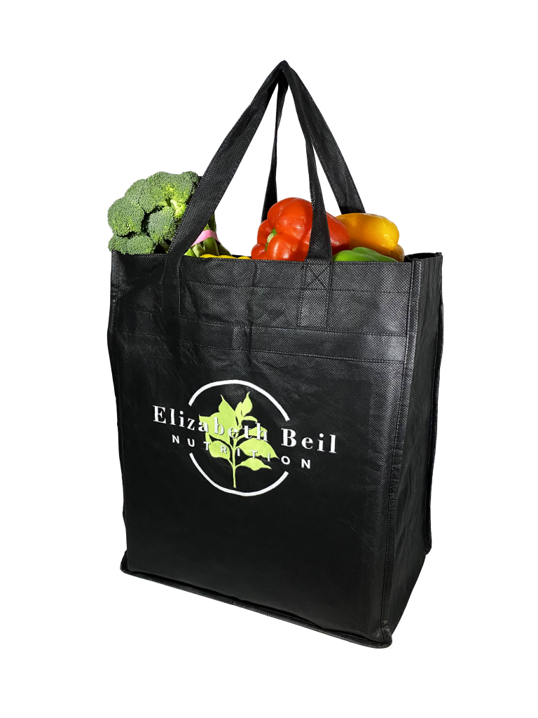
Incorporating the logo and icon on apparel, grocery totes, and more. Providing social media icons and graphics.
03 Business Card
Simple card decision with logo variations and a hierarchal presentation contact information.
Logo Design
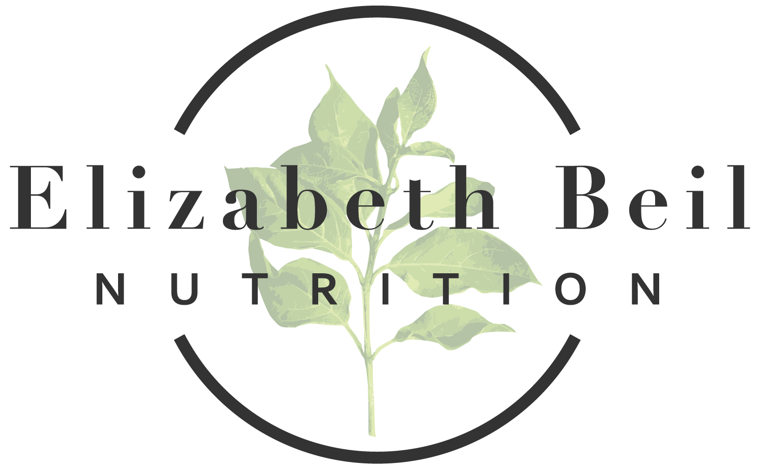
Primary Logo

Primary Icon

Secondary logo
Visual Identity
adding character with distinctive details
Didot
A font to represent the austerity of the black sheep motive by using a text with rigid lines and raw feel.
Corbel
A secondary font to bring to life the viscosity of the whiskey itself, with smooth lines and a stout stature.
Fresh
Hex | #A6D974
CMYK | 38%, 0%, 71%, 0%
RGB | 166, 217, 116
A crisp green that brings a natural energy and a fervent representation of life.
Focus
Hex | #333333
CMYK | 69%, 63%, 62%, 58%
RGB | 051, 051, 051
A slate that is more welcoming than pure black and more poignant grey.
tranquill
Hex | #ffa59d
CMYK | 0%, 44%, 29%, 0%
RGB | 255, 165, 157
A pastel peach to accent fresh and focus that brings more life and a peaceful tone.
Marketing
connecting with social media
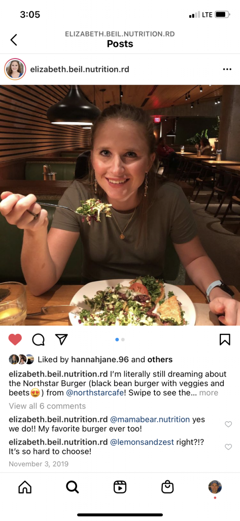
Elizabeth highlights her brand by posting photos of her merchandise in use, whether that be her apparel or tote bags. We provided consultation on social media style and creating a welcoming environment so potential customers were comfortable reaching out to Elizabeth regarding their nutritional needs. One way this way achieved was by using an inviting photo of Elizabeth as her social media icon.
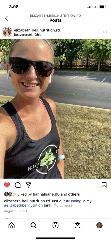
Apparel
Reusable Tote
Business Cards
Nutritional Philosophy of Intuitive Eating


